10 Enhancements Coming Soon to a SID/STAR Chart Near You
The more things change the more they stay the same. You see evidence of this every day, though sometimes you have to look harder to find it. So, here’s a bit of good news about change. Jeppesen is making ten IFR chart enhancements that won’t feel like change at all. While the enhanced charts make look a bit different, Jeppesen never lost sight of what an aeronautical chart was created to do—make flying safer and simpler.
Intuitive Enhancements
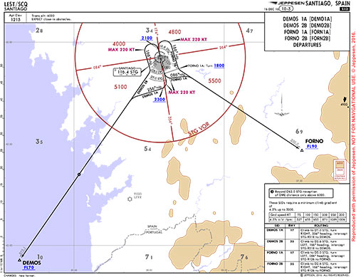
Soon, chart enhancements will start to appear on standard instrument departure (SID) and standard arrival (STAR) charts. The enhancements will begin on charts around European airspaces, and then work their way onto charts across North America and the rest of the world. Increased situational awareness, reduced heads-down time and a lower likelihood of violating flight restrictions are at the heart of these refinements, which include:
- Topography—Integrates color to show terrain and contours, hydrography, international boundaries and identifies the highest point (terrain or man-made) with arrows.
- GRID MORAs—Includes grids formed by 30 minutes or 1 degree of latitude/longitude depending on the state publication. Altitudes are represented in abbreviated form by indicating thousands/hundreds in smaller characters.
- Altitude Restrictions—Depicted in blue color and in accordance with ICAO standards using above (max)/below (min) lines on altitude limits or lines above and below to depict “At.”
- Speed Restrictions—Includes restrictions at fixes and navaids (plan view), as well as general speed restrictions indicated by At, MIN or MAX in front of the value and are depicted in magenta.
- Minimum Sector Altitude (MSA)—Shown in brown (plan view), the MSA center is identified along the circle, and the diameter is depicted if it differs from 25 nautical miles.
- Navaids—Adapted box and symbology to align with ICAO standards and omitted coordinates to declutter chart.
- Holdings—Based on nautical mile or DME leg lengths and depicted on the to-scale portion of the chart. Holdings based on flight times are depicted with a not-to-scale holding symbol.
- Secondary IFR Airports—Neighboring IFR airports are shown in grey.
- Waypoints— Adapted box and symbology to align with ICAO standards and omitted coordinates to declutter chart.
- Scale Bar—Appears on the left side of the chart, outside the plan view.
Enhanced Training, Too
Jeppesen consulted with TSR Aviation Consulting on these enhancements to make sure they delivered as envisioned. TSR concluded, “After reviewing the new chart design, we found the listed changes to be an improvement in (the) presentation of information. From our point of view, conduct of flight, and especially decision making in flight, will be facilitated by the improved situational awareness resulting from the new chart changes.” Here’s a link to TSR’s study/findings to learn more.
Changes, even seemingly intuitive ones like these, don’t show up like an update to your smartphone where you’re just expected to figure it out. Jeppesen offers several e-learning tools (classroom training was deemed unnecessary) to help you better understand the coming improvements, and to make sure you’re ready the day they arrive.
If you’d like to learn more about the coming enhancements to Jeppesen IFR SID and STAR charts, click here.
The more things change the more they stay the same. You see evidence of this every day, though sometimes you have to look harder to find it. So, here’s a bit of good news about change. Jeppesen is making ten IFR chart enhancements that won’t feel like change at all. While the enhanced charts make look a bit different, Jeppesen never lost sight of what an aeronautical chart was created to do—make flying safer and simpler.
Intuitive Enhancements
Soon, chart enhancements will start to appear on standard instrument departure (SID) and standard arrival (STAR) charts. The enhancements will begin on charts around European airspaces, and then work their way onto charts across North America and the rest of the world. Increased situational awareness, reduced heads-down time and a lower likelihood of violating flight restrictions are at the heart of these refinements, which include:
- Topography—Integrates color to show terrain and contours, hydrography, international boundaries and identifies the highest point (terrain or man-made) with arrows.
- GRID MORAs—Includes grids formed by 30 minutes or 1 degree of latitude/longitude depending on the state publication. Altitudes are represented in abbreviated form by indicating thousands/hundreds in smaller characters.
- Altitude Restrictions—Depicted in blue color and in accordance with ICAO standards using above (max)/below (min) lines on altitude limits or lines above and below to depict “At.”
- Speed Restrictions—Includes restrictions at fixes and navaids (plan view), as well as general speed restrictions indicated by At, MIN or MAX in front of the value and are depicted in magenta.
- Minimum Sector Altitude (MSA)—Shown in brown (plan view), the MSA center is identified along the circle, and the diameter is depicted if it differs from 25 nautical miles.
- Navaids—Adapted box and symbology to align with ICAO standards and omitted coordinates to declutter chart.
- Holdings—Based on nautical mile or DME leg lengths and depicted on the to-scale portion of the chart. Holdings based on flight times are depicted with a not-to-scale holding symbol.
- Secondary IFR Airports—Neighboring IFR airports are shown in grey.
- Waypoints— Adapted box and symbology to align with ICAO standards and omitted coordinates to declutter chart.
- Scale Bar—Appears on the left side of the chart, outside the plan view.
Enhanced Training, Too
Jeppesen consulted with TSR Aviation Consulting on these enhancements to make sure they delivered as envisioned. TSR concluded, “After reviewing the new chart design, we found the listed changes to be an improvement in (the) presentation of information. From our point of view, conduct of flight, and especially decision making in flight, will be facilitated by the improved situational awareness resulting from the new chart changes.” Here’s a link to TSR’s study/findings to learn more.
Changes, even seemingly intuitive ones like these, don’t show up like an update to your smartphone where you’re just expected to figure it out. Jeppesen offers several e-learning tools (classroom training was deemed unnecessary) to help you better understand the coming improvements, and to make sure you’re ready the day they arrive.
If you’d like to learn more about the coming enhancements to Jeppesen IFR SID and STAR charts, click here.