Alright, we’ve all been there. You’re taxiing out at a massive airport, visibility isn’t great, and suddenly, you’re surrounded by a maze of hold-short lines, service vehicles and intersecting taxiways. Staying on track can feel like threading a needle—while flying through turbulence. That’s where Smart Airport Maps come in. Think of them as Airport Moving Maps (AMM) on steroids. They’re the navigation companion you didn’t know you needed, and once your pilots use them, they won’t want to go back.
Today, we’re going to give you the lowdown on what Jeppesen Smart Airport Maps are, why they’re different (and better) than traditional Airport Moving Maps, and how they’ll make your ground movements smoother, shorter and a whole lot safer.
What are Smart Airport Maps?
You know those static terminal charts we’ve been using since EFBs became a thing? They’re great for showing the basic layout of an airport—runways, taxiways, parking stands—but that’s about it. They’re essentially paper charts on a screen. Handy? Sure. But when the ramp gets busy or weather rolls in, their usefulness drops off fast.
Airport Moving Maps helped evolve that experience with dynamic, data-driven visuals of major airports. But even AMMs have their limits—they’re often a one-size-fits-all solution, with little consideration for your specific aircraft or the real-time situation.
Smart Airport Maps take it to the next level. They blend live, contextual information tailored to your aircraft type, the current traffic picture and weather conditions. Think of it like having a co-pilot who’s monitoring everything and layering all that info into one seamless, pilot-friendly map.
How Smart Airport Maps work
Behind the scenes, Smart Airport Maps pull from multiple data sources—ADS-B, NOTAMs, and of course, Jeppesen’s aeronautical database. All that info is packaged into a clean, intuitive display on your EFB (FliteDeck Pro), giving you a real-time snapshot of where you are and what’s happening around you.
Are Smart Airport Maps different from Airport Moving Maps?
You might be thinking, “Okay, but how much better are these than my current AMM?” Good question. Here’s our take:
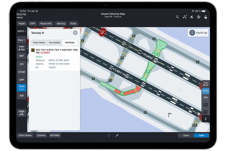
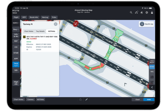
Graphical State NOTAMs Traditional text-based NOTAMs can be difficult to interpret quickly during high-workload phases of flight. Smart Airport Maps translates critical regulatory data into Graphical State NOTAMs, visually displaying runway and taxiway closures on the airport map according to their scheduled active periods. Pilots can build a curated list of selected NOTAMs for quick access, simplifying interpretation and allowing crews to spot potential surface hazards instantly.
Graphical NOTAMS displays runway and taxiway closures visually on the airport map, according to their scheduled active period.
Graphical Company NOTAMs Airlines frequently issue specific internal directives that flight crews must follow. Smart Airport Maps presents operator-specific Company NOTAMs both textually and graphically on the airport map. Integrating internal procedures directly into the primary visual workflow improves consistency, compliance, and overall operational safety across your fleet.
Live Ground Traffic Visualization Congestion and unexpected traffic on the airport surface can lead to costly delays and increased conflict risks. Smart Airport Maps features Live Ground Traffic Visualization, which displays real-time aircraft and vehicle movements directly on the airport map. Enabled through internet or ADS-B device-based connectivity, this capability allows flight crews to quickly assess real-time traffic conditions, anticipate potential conflicts, and navigate the airport surface with heightened confidence.
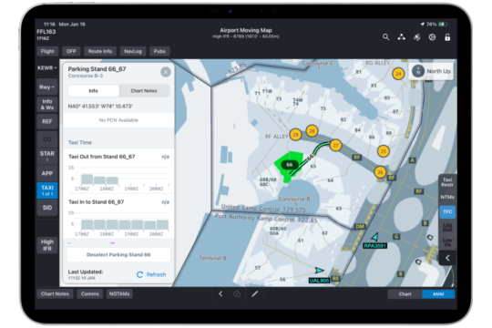
Current and historical taxi time data Accurate planning is essential for efficient ground operations. Smart Airport Maps provides access to live taxi time estimates and historical trends based on the specific time of day and year. Flight crews can further refine these estimates by selecting their assigned parking stands and runways. This predictive data helps crews anticipate ground delays, plan departure sequences more accurately, and optimize opportunities for reduced-engine taxiing to conserve fuel.
Smart Airport Maps shows current and historical taxi times.
The biggest benefits for pilots
using Smart Airport Maps
Now that you’ve got the gist, here’s why we think every flight crew should be using Smart Airport Maps:
Enhanced situational awareness: This is the bread and butter. Whether you’re navigating a foggy ramp at O’Hare or taxiing at an unfamiliar overseas hub in a widebody, having graphical NOTAMs and live ground data at your fingertips means your pilots always know what’s going on. No more guessing what that follow-me truck is doing or how close that 777 is.
Improved safety: We’ve all gotten that “Hold short of taxiway Delta” call that makes you double-check where the line is. Smart Airport Maps helps crews spot hazards quickly, ensuring safety-critical information is considered during flight briefings and communication with ATC. Fewer guesswork moments = safer taxi operations.
Reduced delays: Ever sat through a never-ending taxi out of JFK during the morning rush? Smart Airport Maps help you anticipate current taxi delays using real-time data. You may not skip the wait entirely, but at least now you’ll know why—and maybe even adjust fuel-saving reduced engine taxi procedures accordingly to save your airline money. You might even avoid compounding delays with missed turns or late instructions.
Better workflow integration: Since Smart Airport Maps are integrated right into Jeppesen FliteDeck Pro, you’re not toggling between apps. Everything’s in one place: maps, NOTAMs, traffic, taxi times and airport-specific insights. It’s clean, seamless and just makes life easier—especially in the high-pressure moments.
Example: How Smart Airport Maps
adapt in real-time
Let’s walk through a scenario. Say you’re number six in line for departure, and ATC starts rerouting traffic from the north taxiway as congestion builds. With Smart Airport Maps, you can:
See traffic build-up instantly: Congested areas are visible live on the map.
Anticipate delays: The map helps you estimate your taxi-out time based on real-time ground movement.
Select alternate routes: If ATC reassigns you to a secondary taxiway, you’ll have visual support immediately.
Execute effortlessly: Everything is visual, intuitive, and clear—so you stay ahead of the chaos while others scramble to keep up.
Your map to flawless flight
Smart Airport Maps are a big leap forward in airport surface navigation. They’re not about replacing your judgment—they’re about supporting it with smarter, faster, more informed decisions. Whether it’s cutting down taxi time, avoiding risk or simply boosting your awareness, these maps aren’t just “nice to have.” They’re a game-changer in your airline’s journey toward flawless flight.
If you haven’t flown with them yet, give them a try the next time you’re headed into a complex or unfamiliar airport. Once you experience maps that adapt to your aircraft and situation in real time, you’ll wonder how you ever managed without them.
And hey—you might even start looking forward to those long taxi times. (Okay, maybe not. But close.) Stay safe, and happy flying!